Remixing an Animated Card Using Only CSS
I recently came across a cool animated hover card on this website. I am a fan of micro-animations and this is a great example. One of the best ways to learn how to create cool animations is by copying or remixing them to make them your own. I’ll recreate this card effect without referencing the source’s HTML or CSS, using only CSS for the animation.
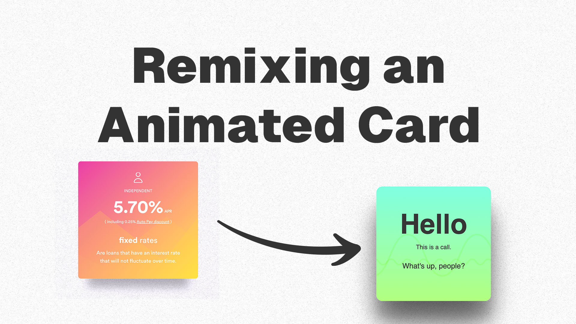
Examining the right card closely reveals four small animations:
- the card itself scales up in size
- the drop shadow changes to make the card look like it is lifted off the page
- a small text blurb slides up
- the background graphic slides left
I’ve already created a CodePen demo if you want to see the final product. You can also refer to it as I discuss each part of the animation. Now let’s break down this component.
Breaking Down the Animation
1. Scaling Up the Card
This part of the animation is the most effective in selling the 3D effect to the user. Scale up the card to make it look like it is lifted off the page. These micro-animations will trigger on hover. Let’s start with the HTML structure of our card component.
<div class="container">
  <h1>Hello</h1>
  <p>This is a call.</p>
  <p class="reveal">What's up, people?</p>

  <svg
    class="tall"
    xmlns="http://www.w3.org/2000/svg"
    xml:space="preserve"
    viewBox="0 0 1000 200"
  >
    <path
      fill="none"
      stroke="#000"
      stroke-miterlimit="10"
      stroke-width="4"
      d="M0 46c45.5 0 45.5 108 90.9 108 45.5 0 45.5-108 90.9-108 45.5 0 45.5 108 90.9 108 45.5 0 45.5-108 90.9-108 45.5 0 45.5 108 90.9 108C500 154 500 46 545.4 46c45.5 0 45.5 108 90.9 108 45.5 0 45.5-108 90.9-108 45.5 0 45.5 108 90.9 108 45.5 0 45.5-108 90.9-108 45.5 0 45.5 108 90.9 108"
    />
    <path
      fill="none"
      stroke="#000"
      stroke-miterlimit="10"
      stroke-width="4"
      d="M1020 90c15.2 0 15.2 20 30.3 20 15.2 0 15.2-20 30.3-20 15.2 0 15.2 20 30.3 20 15.2 0 15.2-20 30.3-20s15.2 20 30.3 20c15.2 0 15.2-20 30.3-20 15.1 0 15.1 20 30.3 20 15.1 0 15.1-20 30.3-20 15.1 0 15.1 20 30.3 20 15.1 0 15.1-20 30.3-20 15.2 0 15.2 20 30.3 20 15.2 0 15.2-20 30.3-20 15.2 0 15.2 20 30.3 20 15.1 0 15.1-20 30.3-20 15.2 0 15.2 20 30.3 20 15.2 0 15.2-20 30.3-20 15.2 0 15.2 20 30.3 20 15.2 0 15.2-20 30.3-20 15.2 0 15.2 20 30.3 20 15.2 0 15.2-20 30.3-20 15.2 0 15.2 20 30.3 20 15.2 0 15.2-20 30.3-20 15.2 0 15.2 20 30.3 20 15.2 0 15.2-20 30.3-20 15.1 0 15.1 20 30.3 20 15.2 0 15.2-20 30.3-20 15.2 0 15.2 20 30.3 20 15.2 0 15.2-20 30.3-20 15.2 0 15.2 20 30.3 20 15.2 0 15.2-20 30.3-20 15.2 0 15.2 20 30.3 20 15.2 0 15.2-20 30.3-20s15.2 20 30.3 20"
    />
  </svg>

  <svg
    class="short"
    xmlns="http://www.w3.org/2000/svg"
    xml:space="preserve"
    viewBox="0 0 400 100"
  >
    <path
      fill="none"
      stroke="#000"
      stroke-miterlimit="10"
      stroke-width="2"
      d="M0 46c6.1 0 6.1 8 12.1 8 6.1 0 6.1-8 12.1-8 6.1 0 6.1 8 12.1 8 6.1 0 6.1-8 12.1-8 6.1 0 6.1 8 12.1 8 6.1 0 6.1-8 12.1-8 6.1 0 6.1 8 12.1 8 6.1 0 6.1-8 12.1-8 6.1 0 6.1 8 12.1 8 6.1 0 6.1-8 12.1-8 6.1 0 6.1 8 12.1 8 6.1 0 6.1-8 12.1-8 6.1 0 6.1 8 12.1 8 6.1 0 6.1-8 12.1-8 6.1 0 6.1 8 12.1 8 6.1 0 6.1-8 12.1-8 6.1 0 6.1 8 12.1 8 6.1 0 6.1-8 12.1-8 6.1 0 6.1 8 12.1 8 6.1 0 6.1-8 12.1-8 6.1 0 6.1 8 12.1 8 6.1 0 6.1-8 12.1-8 6.1 0 6.1 8 12.1 8 6.1 0 6.1-8 12.1-8 6.1 0 6.1 8 12.1 8 6.1 0 6.1-8 12.1-8 6.1 0 6.1 8 12.1 8 6.1 0 6.1-8 12.1-8 6.1 0 6.1 8 12.1 8 6.1 0 6.1-8 12.1-8 6.1 0 6.1 8 12.1 8 6.1 0 6.1-8 12.1-8 6.1 0 6.1 8 12.1 8"
    />
  </svg>
</div>
The component has two basic sections, text elements and graphic elements. In my demo, I use two SVG elements I created. You can use an image (like a JPEG or PNG) instead if you prefer. All of the hover effects will be in a CSS block:
.container:hover {
  /* Hover effects */
}
To scale up our card, add transform: scale(1.02);. This will transform both the X and Y scale by 2%. You should play with the value we pass in to change how much you want the card to scale up.
2. Animate the Drop Shadow
This effect can be handled in many ways. If you look at the “before” box-shadow style (box-shadow: 1px 3px 8px rgba(0, 0, 0, 0.8);), you will see it is a basic drop shadow with a small offset and small blur radius. It is also fairly dark at 80% black. In our hover effect, we will have two sets of shadows.
box-shadow: 0 60px 80px rgba(0, 0, 0, 0.6), 0 45px 26px rgba(0, 0, 0, 0.14);The first shadow has a large offset (60px) and a very large blur radius (80px). It gives the card a very harsh shadow, as if the light is slightly above and behind the card as it lifts. The second shadow has a medium offset (45px) and a smaller blur radius (26px). This gives a soft shadow that is as if a soft light is closer to being almost on top of the card. The combination of the two shadows looks more realistic since in most real-life cases there is often more than one source of lighting.
3. Slide Text Up
This is a basic animation that is not really necessary, but including it adds a little more life to the animation, taking it to the next level. There are two parts to this animation. First, this line, transform: translateY(-10px);, slides the text up 10 pixels. Second, this line, opacity: 1;, fades in the .reveal text block.
4. Slide the Graphics
The graphics animation enhances the overall effect, similar to the text effect. I use two wide SVG waves stacked together. On hover, both waves shift to the left, with the smaller wave moving faster and further than the larger one. This creates the impression that the larger wave is “heavier” and moves slower. Mimicking real-world physics in animations makes them appear more lifelike.
CodePen Demo
Here is the final CodePen Demo. You will notice that the CSS is more intricate than I have explained. A lot of it is purely the aesthetics of the card. I also utilized CSS variables to make it easy to tweak the animation in one section of the code.
See the Pen CSS Animated Hover Card by Wil Chow (@JavaJunky) on CodePen.
That’s All
It is always good to practice recreating effects you find cool and interesting. Whether you try to copy the effect exactly or make it your own by remixing it like I did, the task will often make you try things you haven’t before, learn something new, and it’s also a little exercise to keep you sharp.
Sprouts 🌱 are early ideas that might need revision and attention.
Saplings 🌿 are a step above—not fully developed but more fleshed out than sprouts.
Evergreens 🌲 are complete and likely won't be updated anymore.
Read more about my digital garden.